

The Last Minute Read-a-Thon of 2013 is hosted by Maria over at A Night's Dream of Books and by me.
For more information on this read-a-thon just visit here.
Today's challenge is:
For more information on this read-a-thon just visit here.
Today's challenge is:
Love It or Hate It
Post up book covers that you love and hate explaining why.
Book Covers I Love:


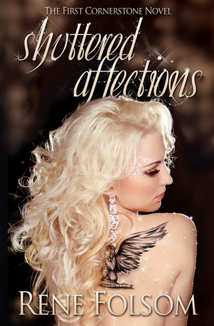


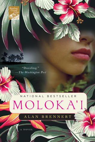


It is obvious that I like very bold, bright covers. It doesn't matter if there's a person on them or if it's zoomed in objects, if it's got full of color and it shows that the artist tried to make the cover appealing, then I like it. I also like it when the covers play with the titles like the one for Eggs by Jerry Spinelli. It shows that the artist was trying to stay true to the book. Also, if there's some sort of texture on the books or "glitter", then I like it even more. For example, Warm Bodies has a very soft cover. I love rubbing my hands all over it.
Book Covers I Hate (Dislike):


I dislike books that have boring and too simple covers. It makes it appear that the artist was too lazy and didn't care what the final product looked like. Some feel that by putting a photograph with big text is enough. Not for me. Also, I don't always like books that have the movie covers on them. I feel like their saying that the book is only good if it's turned into a movie. Next, there are books were the artist does try but it doesn't come out right, like Desire and Life After Phantom. Here we can see that there was some attempt of creating something nice. Unfortunately, the final product feels trashy to me (Desire is actually a good book for those who like erotica). The covers that really irk me are the ones that are done digitally. These always remind me of really bad porn animations (I refuse to post one here).
Pretty covers are becoming more popular today and authors/publishers are noticing this. We're not supposed to judge a book by its cover but with rising popularity of ebooks, there is a need to attract people to print books. One example that I've encountered has been Marc Johnson's books. His books started off very plain and simple, but then a new and better covers come out a few months later:

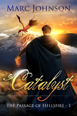

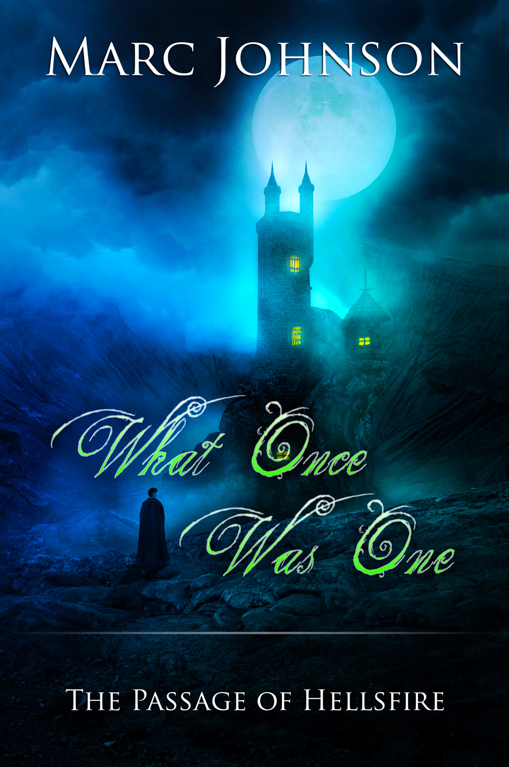
What a difference, right?
My Progress:
Day 1
Number of pages read: 141
Number of minutes listened to: 63
Number of books completed: 0
Day 2
Number of pages read: 83
Number of minutes listened to: 133
Number of books completed: 1 (The War Inside by M. Kircher)
This read-a-thon has giveaways for two winners! One is given by me here, and the other is given over at A Night's Dream of Books. Like Maria's, mine is an international giveaway.
a Rafflecopter giveaway
Tomorrow is the "Remembering 2013" Challenge!
Hey, Vonnie!
ReplyDeleteI totally agree with you about these covers, with one exception. I love the cover of "Twilight". I just think that the picture of the main Cullen clan members looks great! But then, I'm such a die-hard Twilight fan....lol.
I do agree with you regarding bold, bright covers. I love such covers, too! My favorites from the ones you like are the covers of "Into the Deep", "Escaping Darkness", and "Molokai". It's too bad that "Into the Deep" is an ebook, because I would have bought it otherwise...oh, well....
The covers you dislike are really AWFUL!! OMG!!!! Why do publishers allow such horrible-looking covers to be put on books? Incredible! I would never want to buy a book with such an ugly cover. I don't think most people would, either.
Great examples! Thanks for sharing!! : )
Ay, you die-hard Twilight fan :p I don't mind seeing that movie picture as a poster but not on a book. I preferred the hands holding the apple much better.
DeleteHave you read Molokai? It's such a devastating but wonderful book. I highly recommend it.
And yes, I'm glad you feel the same way about the other ugly covers. They can really turn a reader away from reading a book. I almost didn't read Desire because I hated what the cover looked like. The blond girl just looked trashy to me. Then I remembered that I promised to review it so I had no choice but to read it. Luckily it was a really good book. I just hope that a different cover will be published sometime in the near future.
P.S. I meant to comment on the Marc Johnson covers. You are so right -- the covers on the right are SO much better! I LOVE the new cover for "What Once Was One"!! All that gorgeous blue!!!! And the new cover of "Catalyst" is totally awesome, too!
ReplyDeleteI knew that you would love that one, thus I posted it ;)
DeleteI actually like the first cover of The Catalyst because I love how the hands and fire stand out against the black. It really portrayed what the first book was about. But I LOVE the second cover for it. I am a big sucker for colors.
:/ typos
DeleteThat Twilight cover is pretty silly.
ReplyDelete